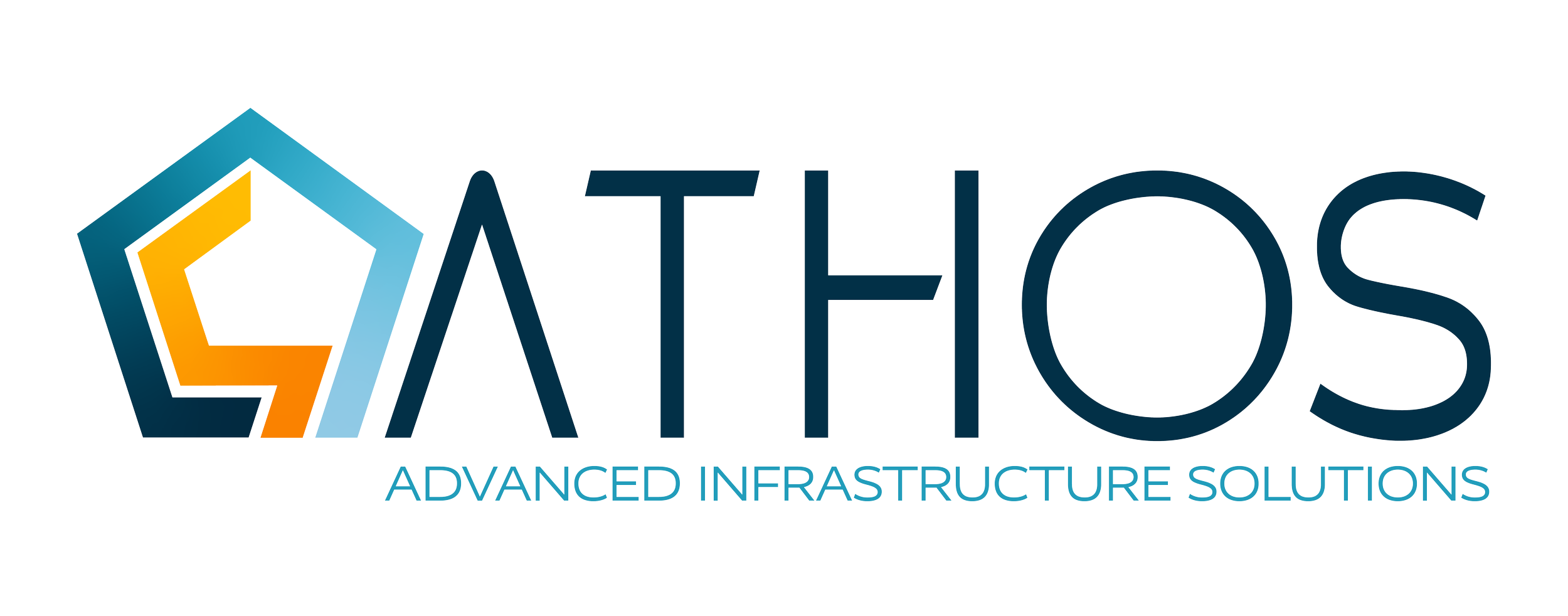
USIC explored the possibility of bringing three specialized organizations, Blood Hound, Reconn, and On Target, under a single master brand. I was responsible for developing a strategic brand identity that unified the three companies while maintaining alignment with USIC's established brand and positioning. The goal was to create a scalable identity system that balanced familiarity, trust, and future growth.
Each company had developed its own reputation, safety score, customer relationships, and visual identity. The challenge wasn't simply designing a new logo, it was creating a brand that represented all three organizations equally while establishing a clear connection to USIC. The identity needed to inspire confidence, communicate collaboration, and feel established from day one rather than like a newly created startup.
Every branding decision had to balance creativity with implementation. Because Blood Hound had recently undergone a rebrand, the organization had already invested heavily in a new digital experience built around the color palette and visual system I created. Creating an entirely new identity would require rebuilding those assets and significantly increase both cost and implementation time.
To maximize existing investments, I intentionally retained the established color palette while developing a new identity system that could be deployed efficiently across the shared website and future marketing materials. This approach allowed the brand to evolve strategically while minimizing disruption.
The Challenge and Constraints
Rather than merging visual elements from each company, I focused on identifying the qualities they shared that we wanted on the forefront: trust, expertise, collaboration, and leadership. The identity system was designed around these common values, creating a brand that felt cohesive without intentionally favoring any individual organization.
Every design decision was evaluated against three principles:
Unify three distinct organizations under one recognizable identity
Leverage existing USIC brand equity and digital investments
Build a scalable visual system capable of supporting long-term growth
Strategic Approach
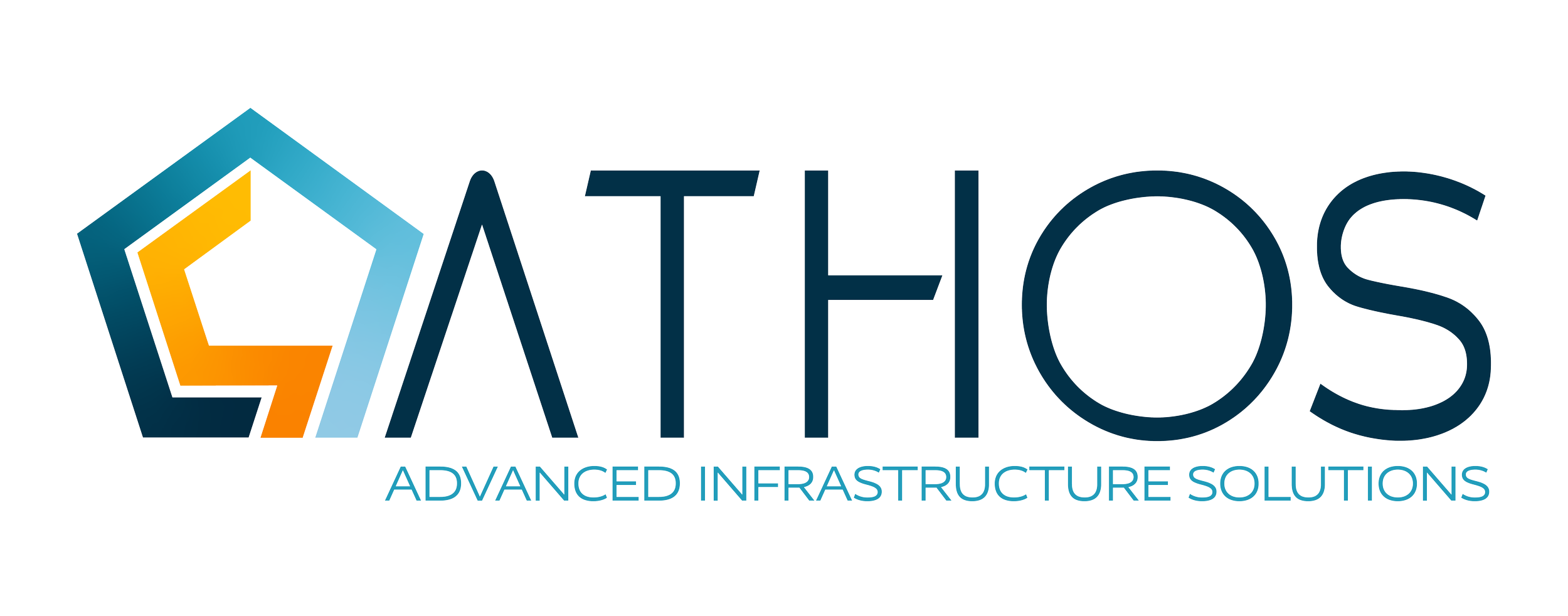
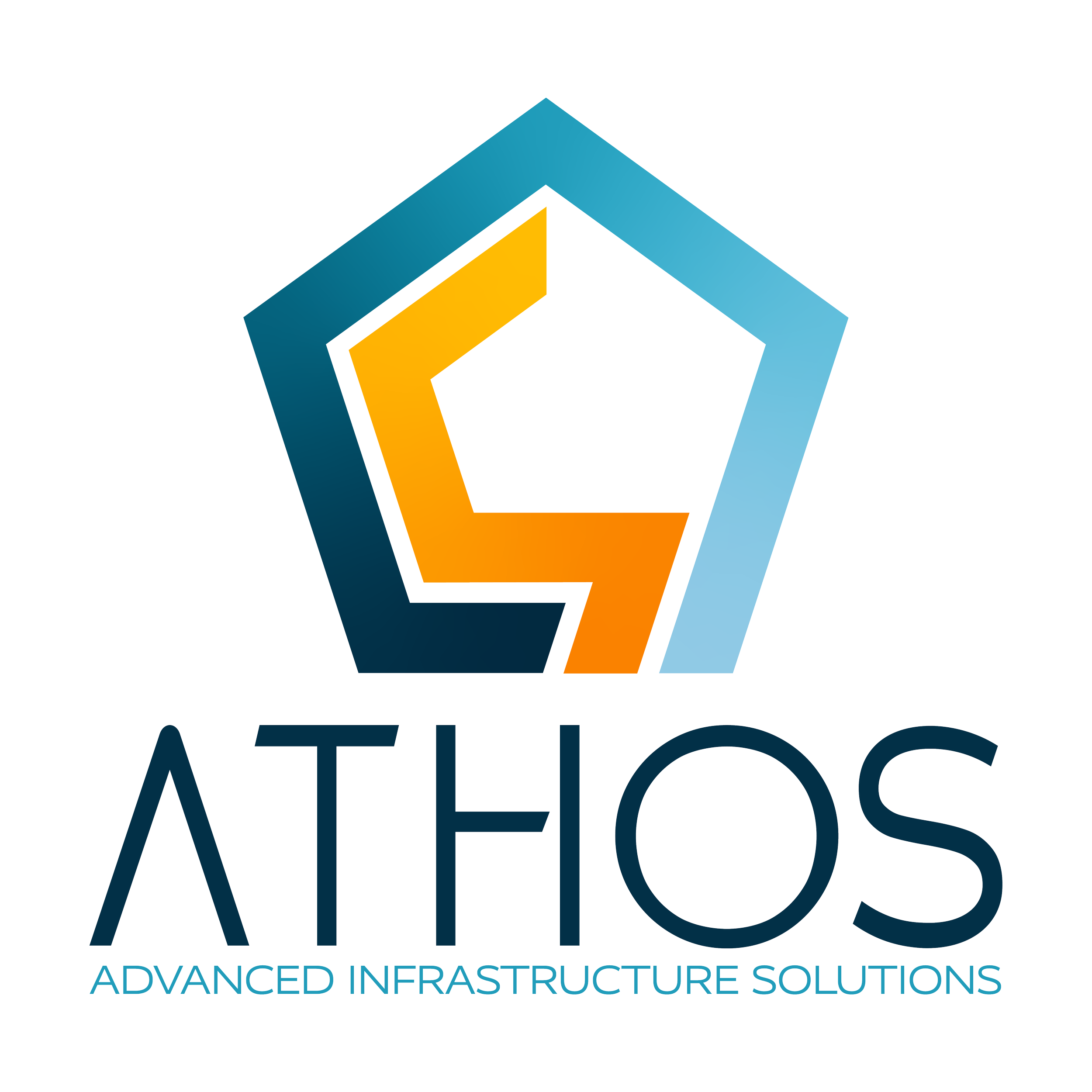
The resulting identity combines familiar brand elements with new visual language to create a distinct yet recognizable master brand. Geometric forms, upward movement, and a strong architectural structure communicate collaboration, stability, and progress, while the refined typography establishes a modern, professional presence. Together, these elements create an identity that feels both connected to USIC and capable of standing on its own.
Solution

Building the Identity
I've always been drawn to brands whose names stand for something greater than the products or services they represent. The strongest identities tell a story, and I wanted every decision behind this concept to carry that same level of intention.
When exploring a name for the unified brand, I kept coming back to Athos. Inspired by The Three Musketeers, it felt like a fitting metaphor for three respected organizations coming together under one identity. Athos is known for his wisdom, integrity, loyalty, and quiet strength. He earns trust not through recognition, but through his unwavering commitment to supporting those around him.
Those qualities became the foundation of the brand. Rather than simply referencing the literary character, Athos was chosen to represent the values of the unified organization: leadership, trust, collaboration, and unwavering support.
Naming the Brand

Each element of the identity was intentionally designed to reinforce the brand's connection to USIC while expressing the values of a unified organization. The geometric framework builds upon familiar brand equity, the upward movement reflects growth and progress, and the central icon anchors the mark with a sense of strength, stability, and shared purpose.
Logo Mark
Pentagonal Framework - Builds upon the geometry of the USIC star, reinforcing brand equity and a strong foundation. While the star represents achievement, the pentagon represents what makes achievement possible: strength, unity, and support.
Upward Motion - Conveys growth, momentum, and the drive to rise to new challenges.
Central Icon - An abstract "A" inspired by the Norse Jera rune reinforces themes of prosperity, integrity, and the rewards of sustained effort, while simultaneously representing the brand name.
Balanced Geometry - Communicates stability, trust, and a scalable identity system.
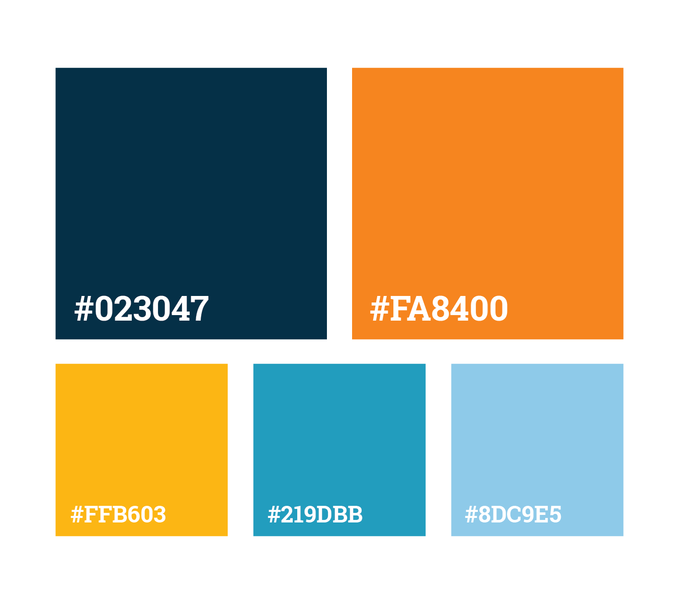
The palette was intentionally retained from the Blood Hound rebrand I’d recently created and had implemented, allowing the organization to leverage existing digital investments while establishing continuity across the new master brand.
Color System

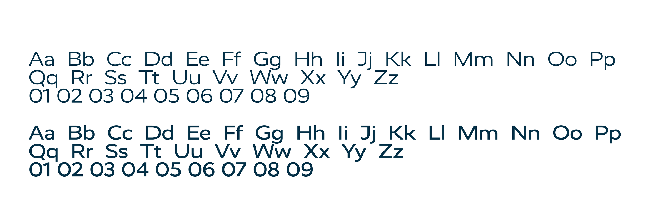
Typography played a key role in establishing the personality of the brand. For the logotype, I used Rukou All Caps as a foundation, then customized the letterforms to create a more distinctive and ownable identity that aligned with my vision for the brand. The refined forms reinforce the geometric language of the mark while giving the wordmark a stronger sense of character and recognition.
Typography
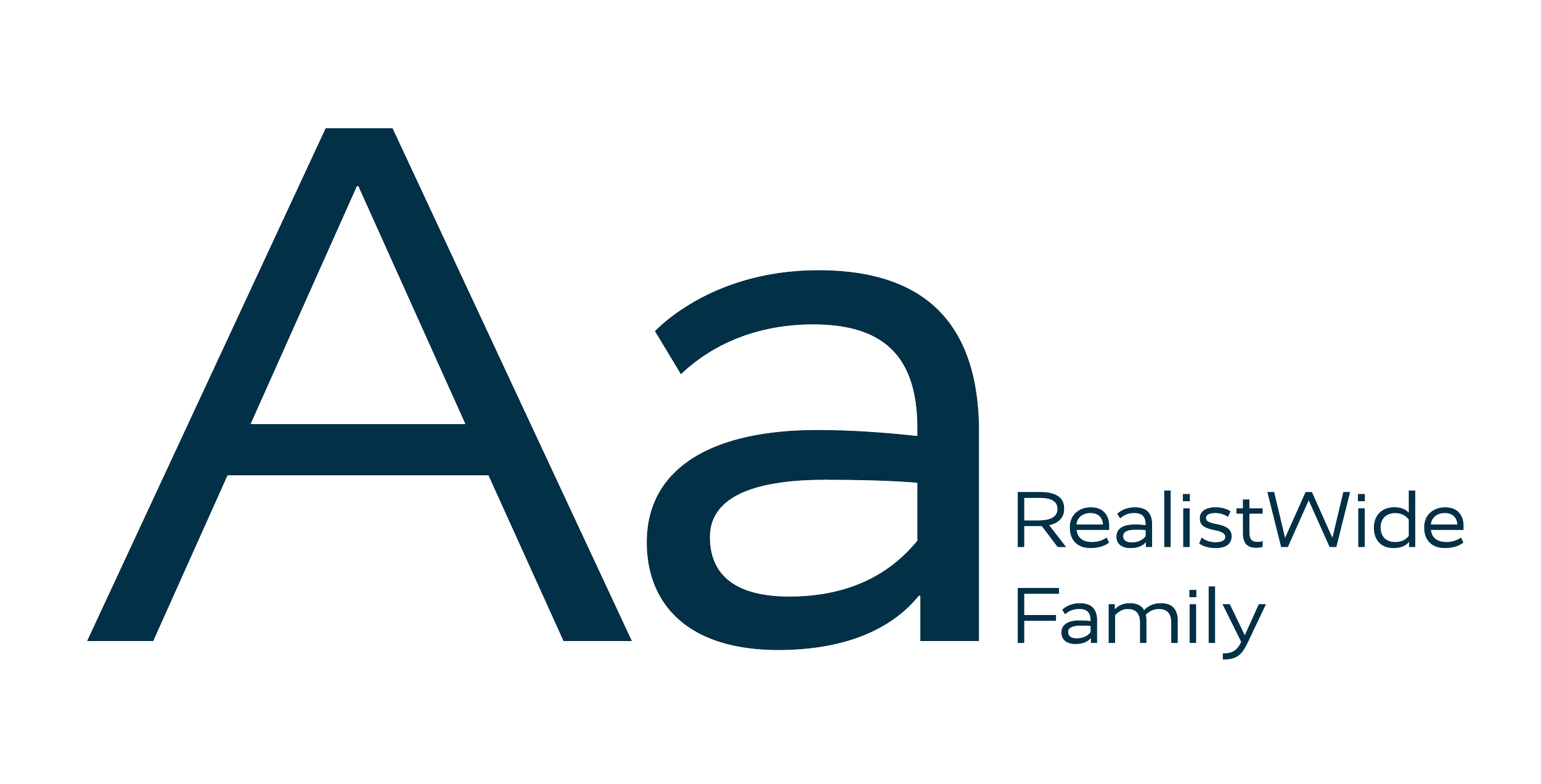
For supporting typography, I selected Realist Wide for the tagline. Its clean, contemporary design provides excellent readability while complementing the custom logotype without competing for attention. Together, the two typefaces create a balanced system that feels modern, confident, and approachable.
This project reinforced that successful branding is about more than creating a memorable logo. It requires balancing business strategy, implementation constraints, and thoughtful storytelling to create an identity that can grow with an organization. It is genuinely one of my favorite examples of designing with both creativity and strategy in mind.

While executive leadership ultimately chose not to move forward with the unified brand at this time, the decision was driven by a desire to preserve the strong brand equity and customer recognition each organization had built independently. As the business continues to evolve, a unified brand architecture remains a potential opportunity for the future.